Ray Serve’s New Grafana Dashboard: Debugging That Wasn’t Possible Before
Starting with Ray v2.54+, Anyscale ships a new Ray Serve Grafana dashboard, available exclusively on the Anyscale platform. It replaces the legacy Serve dashboard and is designed for real production debugging—the kind where you need to answer “why did this happen now?” and “where exactly is the system breaking down?” in minutes, not hours.
This post walks through a realistic production incident and shows how the new dashboard fundamentally changes the debugging workflow.
LinkThe Incident: Latency Spikes After a Routine Deploy
A team rolls out a new model version. QPS is flat. Error rate is flat. But P99 latency almost doubles for a single application.
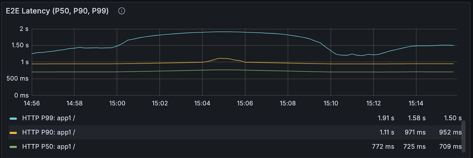
With the old dashboard, you could see that latency was worse—and not much else. You’d be left guessing:
Is it model execution time?
Router queueing?
Autoscaling lag?
Replica health during rollout?
Proxy instability?
With the new Anyscale-only dashboard, that ambiguity disappears.
LinkMoment 1: “Is this a deploy problem or a runtime problem?”
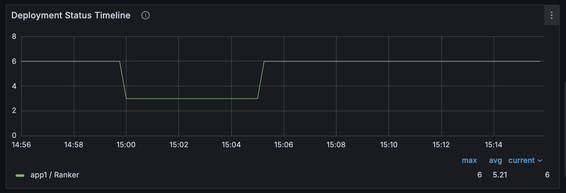
The Application Status Timeline and Deployment Status Timeline answer this immediately.
You can see deployment state transitions—HEALTHY → UPDATING → HEALTHY—aligned directly with the latency regression. This replaces the old stat-only view, where lifecycle changes were invisible unless you dug through logs.
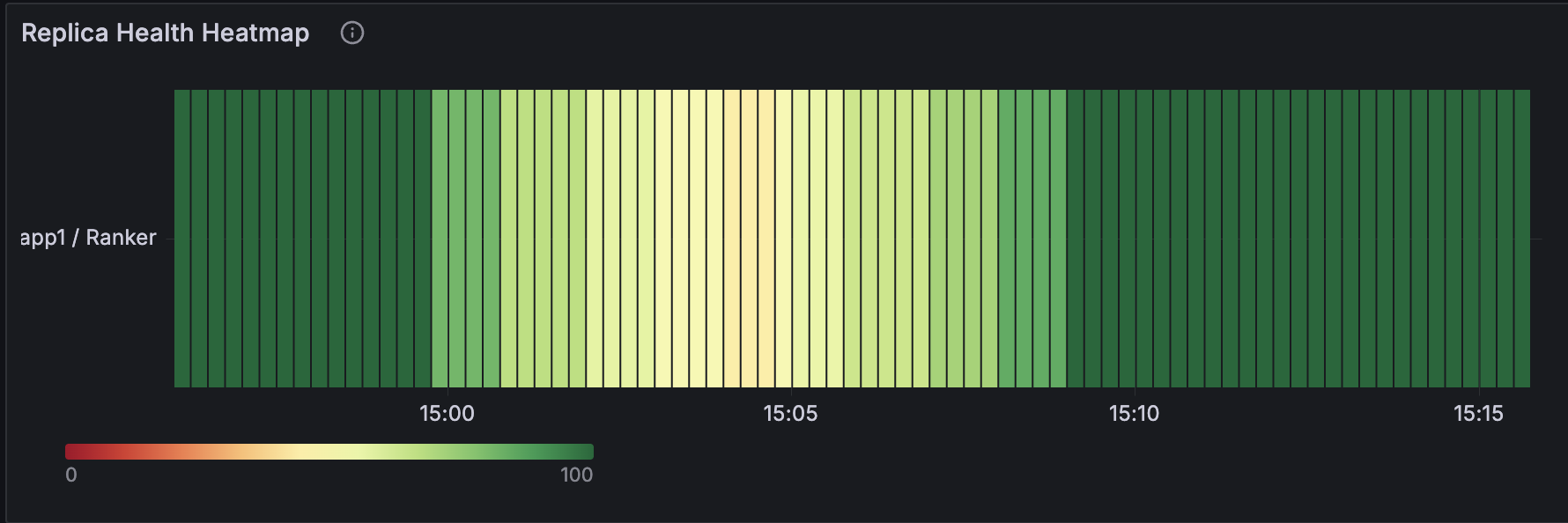
Next, the Replica Health Heatmap shows whether replicas were truly healthy throughout the impact window. Not just counts, but partial health over time. In this case, it exposes rolling-upgrade instability that previously went undetected.
Why this matters:
The first debugging step shifts from guessing the layer to confirming the lifecycle state.
LinkMoment 2: “Where is the latency actually introduced?”
The new dashboard makes the request path explicit by breaking it into three layers:
DeploymentHandle Request QPS (client entry)
Router Request QPS (routing and queueing)
Replica Request QPS (user code execution)

These are paired with Processing Latency, Router Fulfillment Latency, and Queued Requests at Router.
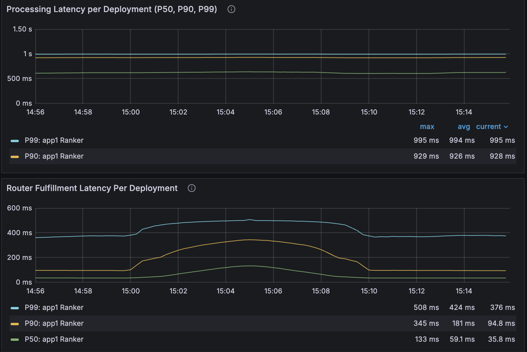
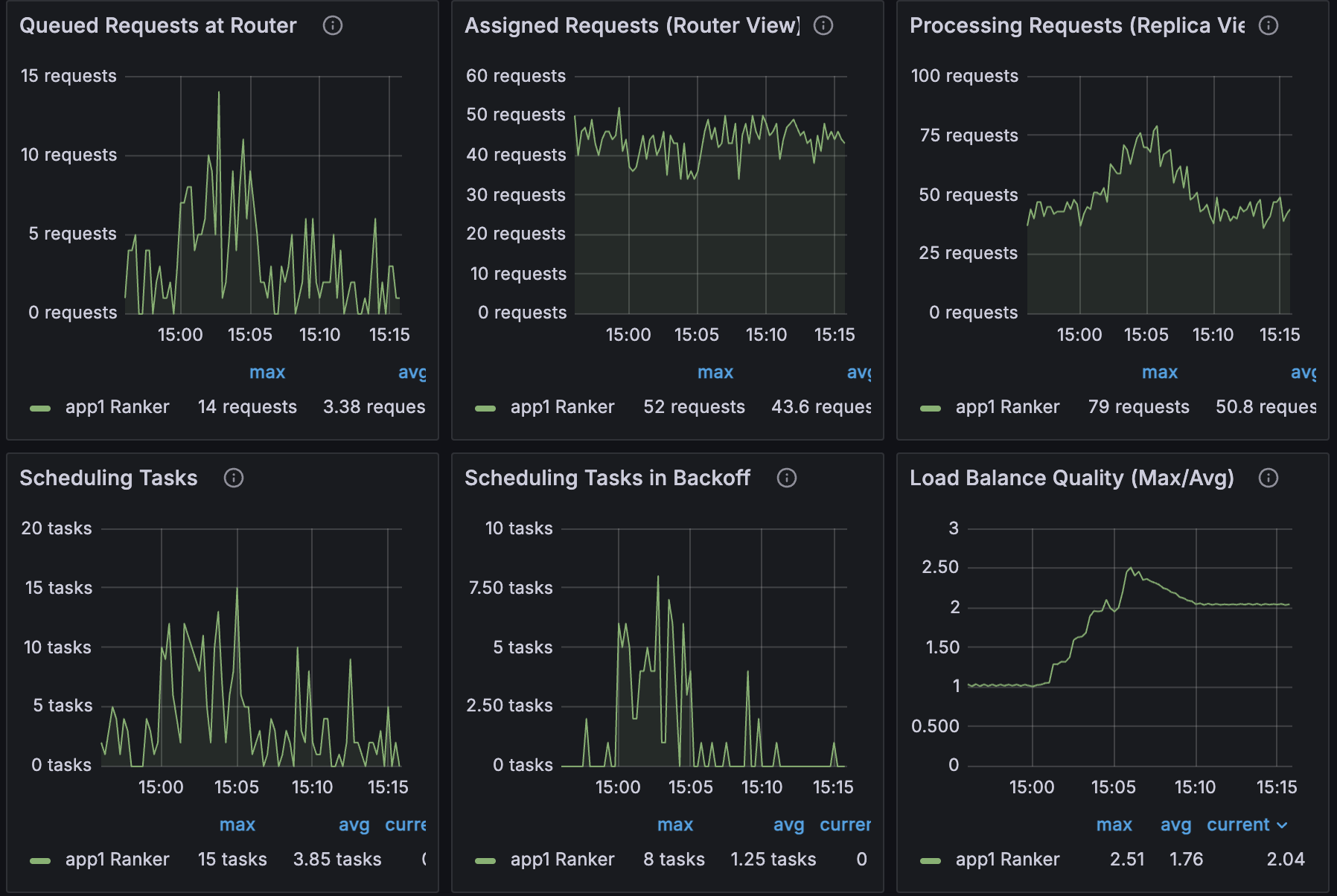
In this incident, the pattern is unmistakable:
Scheduling tasks in backoff spikes
Queued requests at the router spikes
Router fulfillment latency spikes
Replica processing latency stays flat
Conclusion: the regression isn’t in model code—it’s in routing and queueing.
Why this matters:
Previously, queueing delay and execution time were conflated. Now you can prove where the bottleneck lives.
LinkMoment 3: “Why didn’t autoscaling fix it?”
The Target vs. Actual Replicas Over Time panel shows desired replicas ramping up while actual replicas lag behind.

Right next to it, Blocked by Min/Max Limits reveals the root cause: the autoscaler wanted more replicas but hit max_replicas.
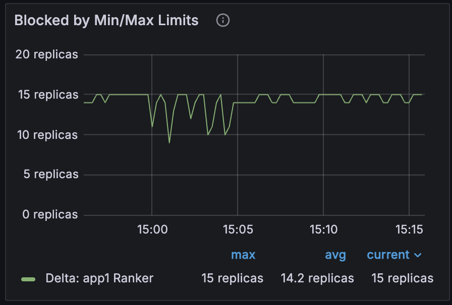
To rule out slow provisioning, you check Replica Startup (P99). If it’s elevated, the delay is bootstrapping. If not, it’s a policy constraint.
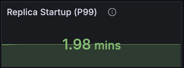
Why this matters:
You can distinguish “we hit a scaling limit” from “the system can’t add capacity fast enough”—without inference or log spelunking.
Seamless Navigation from Grafana to Anyscale Logs (w/ Ray 2.55, Anyscale Exclusive)
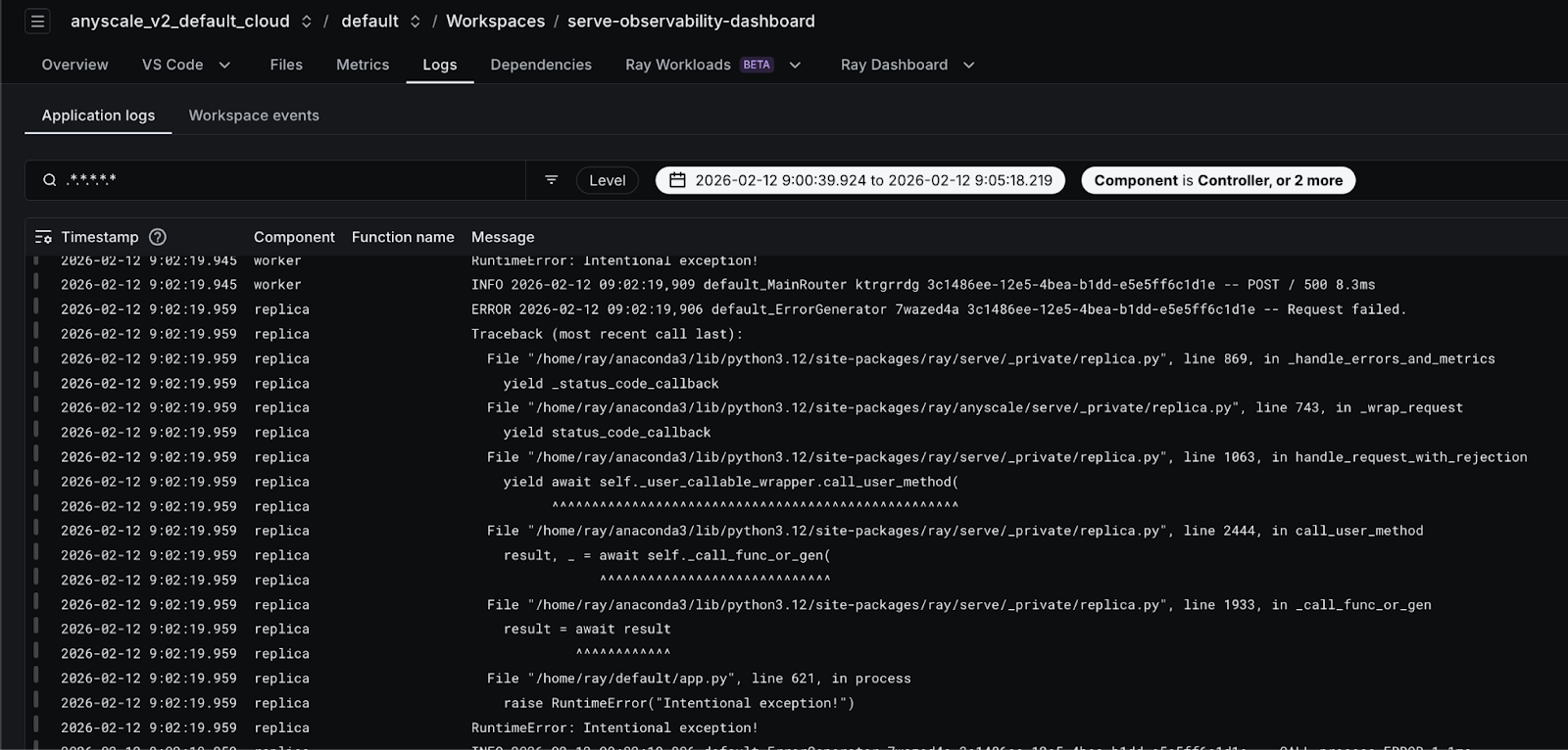
Starting with Ray 2.55, Anyscale customers will be able to navigate directly from all Services Grafana dashboard panels (for example, error QPS or latency charts) to the Anyscale Log Viewer with the exact same time range and application context pre-filtered. With a single click, users are redirected to the appropriate Anyscale Console view—workspace or service—where logs are automatically filtered by start time, end time, application, deployment, and replica for precise scoping. By default, the log view includes controller, replica, and worker logs, significantly reducing the time required to correlate metrics spikes with underlying errors. This tight metrics-to-logs integration meaningfully improves debugging workflows by eliminating context switching and manual filtering, and is enabled as part of the Ray 2.55 release.

LinkWhy This Feels Production-Grade
Production systems don’t fail in one place. They fail across layers. The new dashboard reflects that reality:
Lifecycle states are first-class time series, not buried in logs
The request path is observable end to end
Autoscaling decisions are explainable, not just visible
Serve internals and user code are clearly separable with data
This is what operational maturity looks like. The system doesn’t just tell you that something is wrong—it tells you where and why. If you run Ray Serve in production, this dashboard is the difference between guessing and knowing. Upgrade your Ray version to 2.54 and experience these newly added observability features on Anyscale Workspace & Services.


